Think you know what the world looks like? Think again. Most maps show a view of the planet. Leaders from Africa are trying to change that. They want people to “correct the map.”
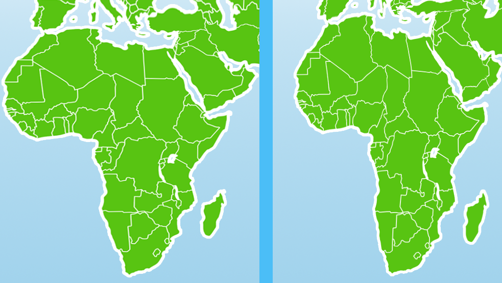
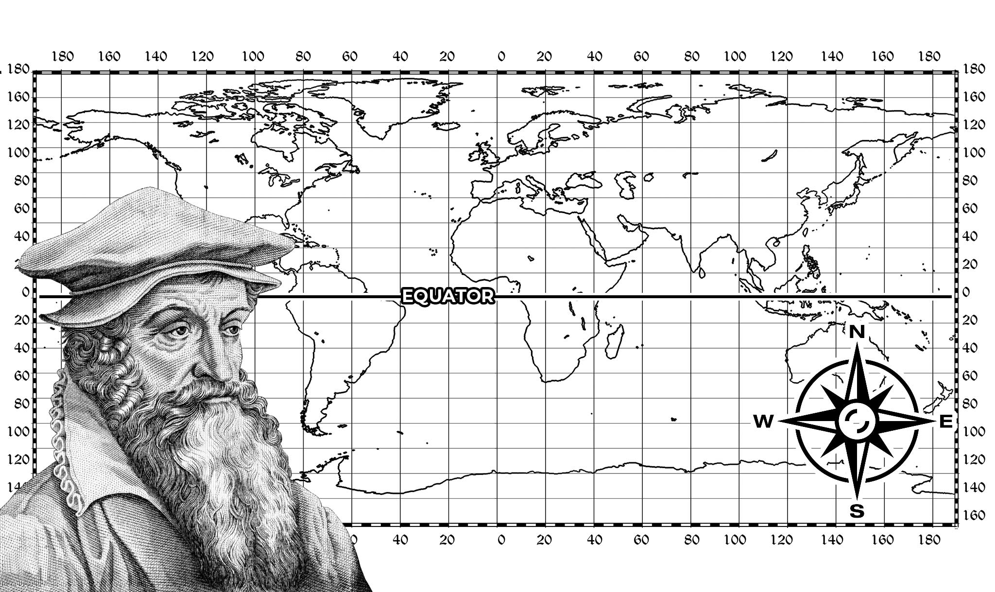
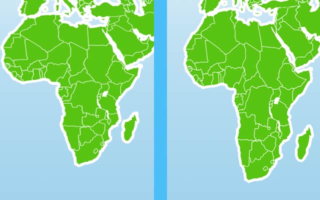
The most common map is the Mercator projection. Gerardus Mercator created it in 1569. It shows the globe as a flat map. There are straight lines of latitude from east to west and straight lines of longitude from north to south. However, this map makes lands farther north and south seem larger than they really are. And places near the equator — like Africa — appear smaller.
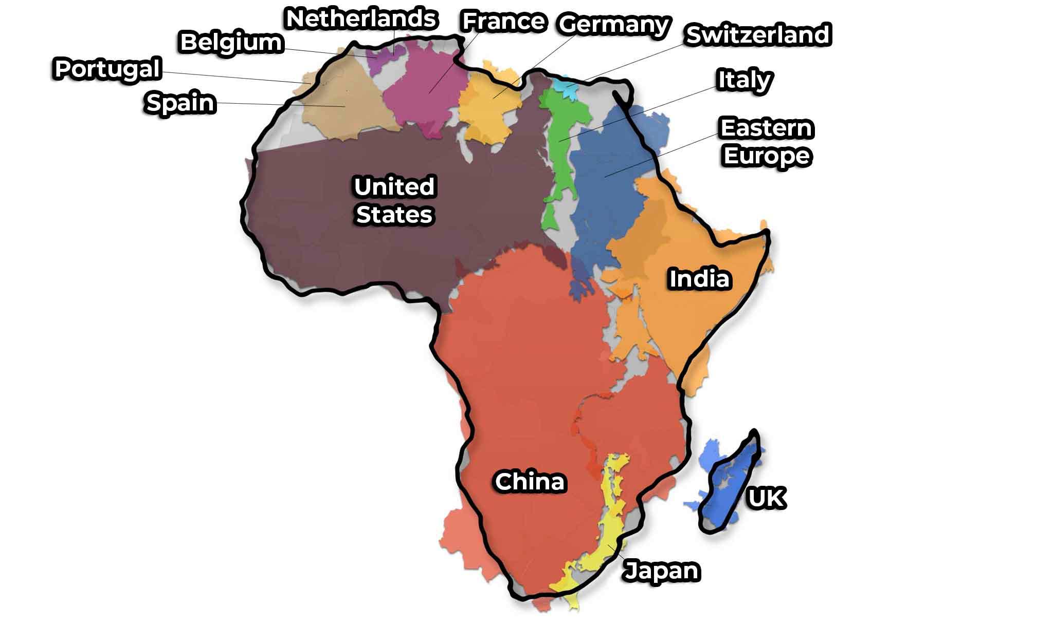
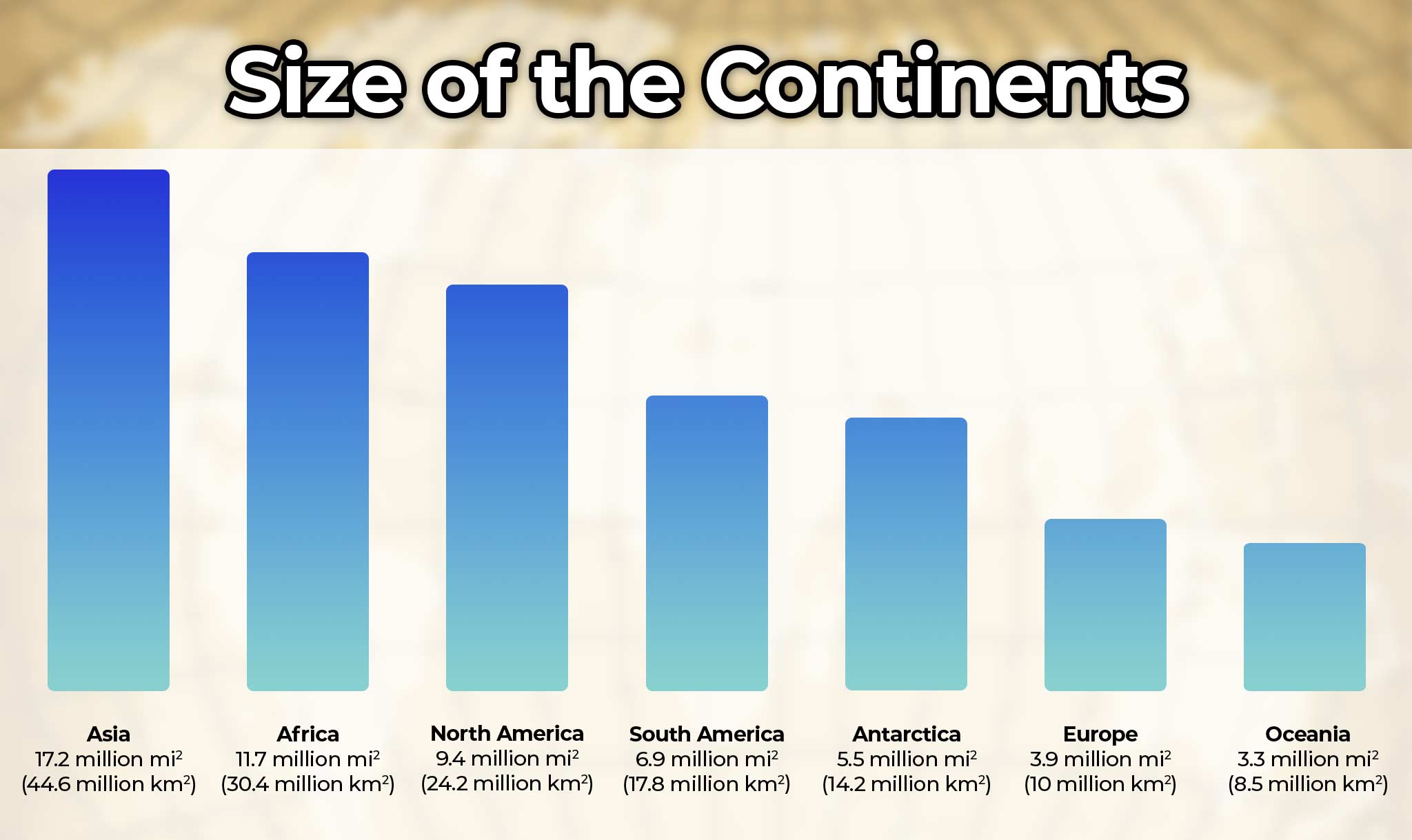
You may have seen this on a map. For example, Greenland might look like the same size as Africa. However, Africa is 14 times bigger! Africa is the second-largest continent. In fact, Africa is so big that it could fit the United States, China, India, Japan, and Mexico.
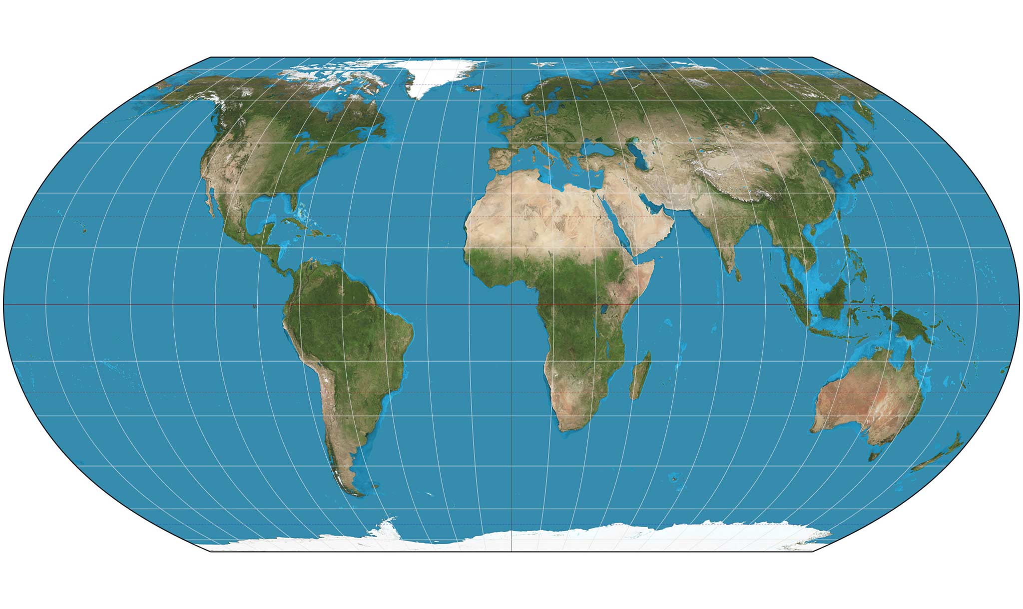
People have tried to create more accurate maps of the world. A cartographer named Tom Patterson made the Equal Earth projection. This map better shows the true shapes and sizes of the continents. And a new is trying to get more people to use it. Its name is “Correct the Map.”
According to the campaign, “Africa is misrepresented on the world maps.” It called that “a reflection of how the world views the continent.” The campaign said the new map will “highlight the true scale, power, and of the African continent.” It said that’s “ for education and geography” and for “a deeper understanding of Africa’s role in the global community.”
Leaders from the African Union (AU) agreed. The group of 55 countries decided to support the campaign in August. The AU is asking people to stop using the Mercator projection. It wants them to use the Equal Earth projection instead.
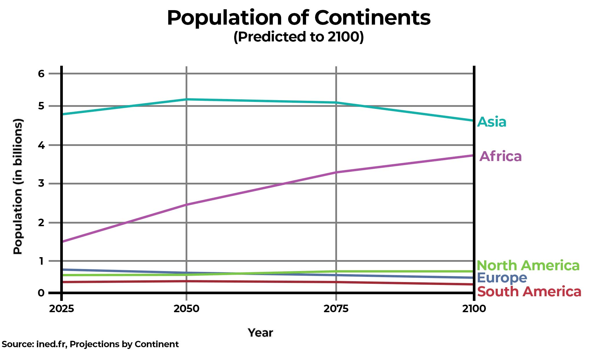
It isn’t only Africa’s land that is large. The continent has a huge population, with more than 1.5 billion people. Africa is the fastest-growing continent. Its population will double by 2070.
By Russell Kahn (Russ)
Updated August 21, 2025, 5:00 P.M. (ET)